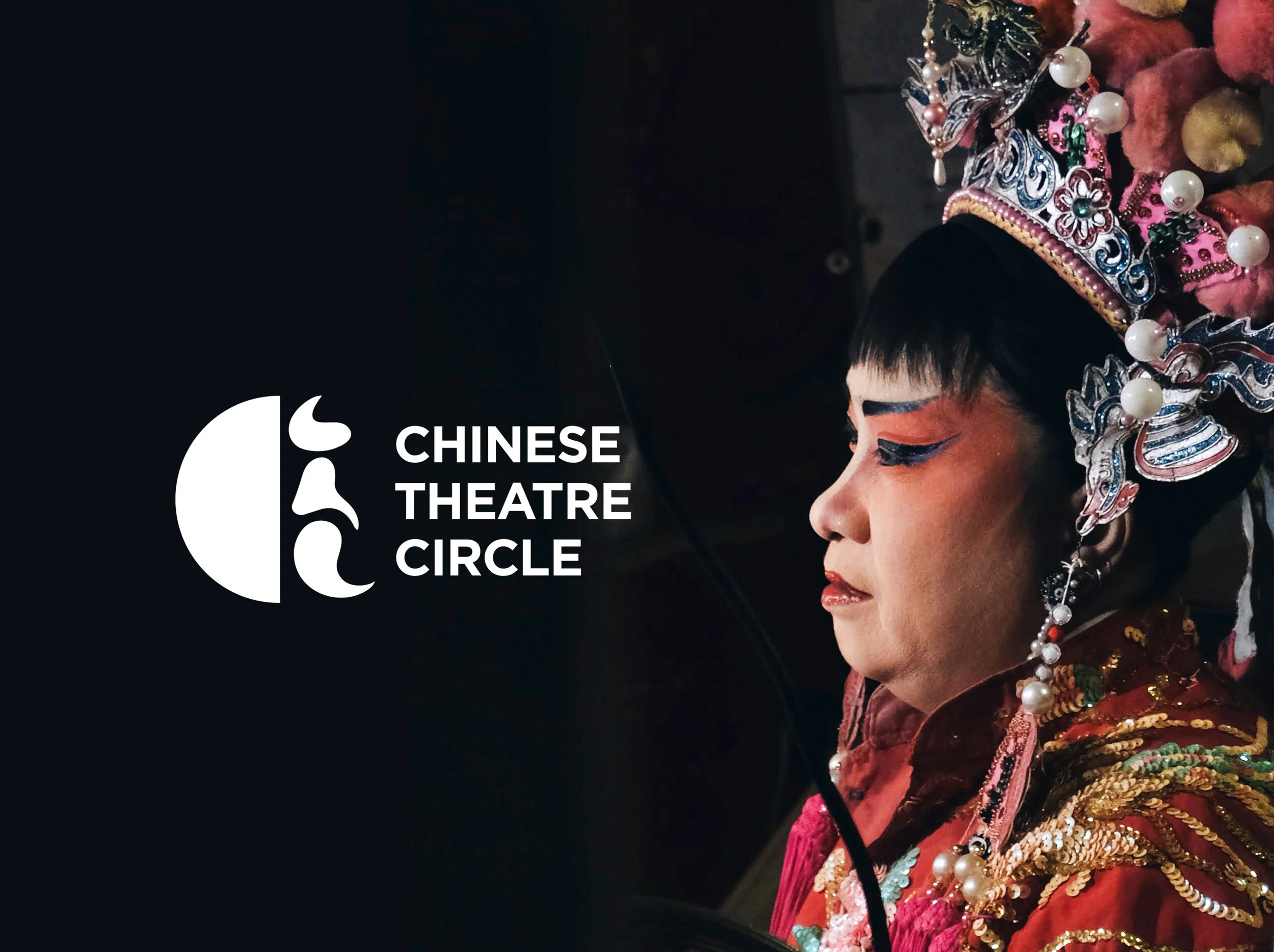
Chinese Theatre Circle: Rebranding Project focuses on attracting the younger generation by positioning the Chinese Theatre Circle as a cultural movement that is contemporary and progressive.
This project was awarded with Red Dot Junior Award in Red Dot Design competition 2020

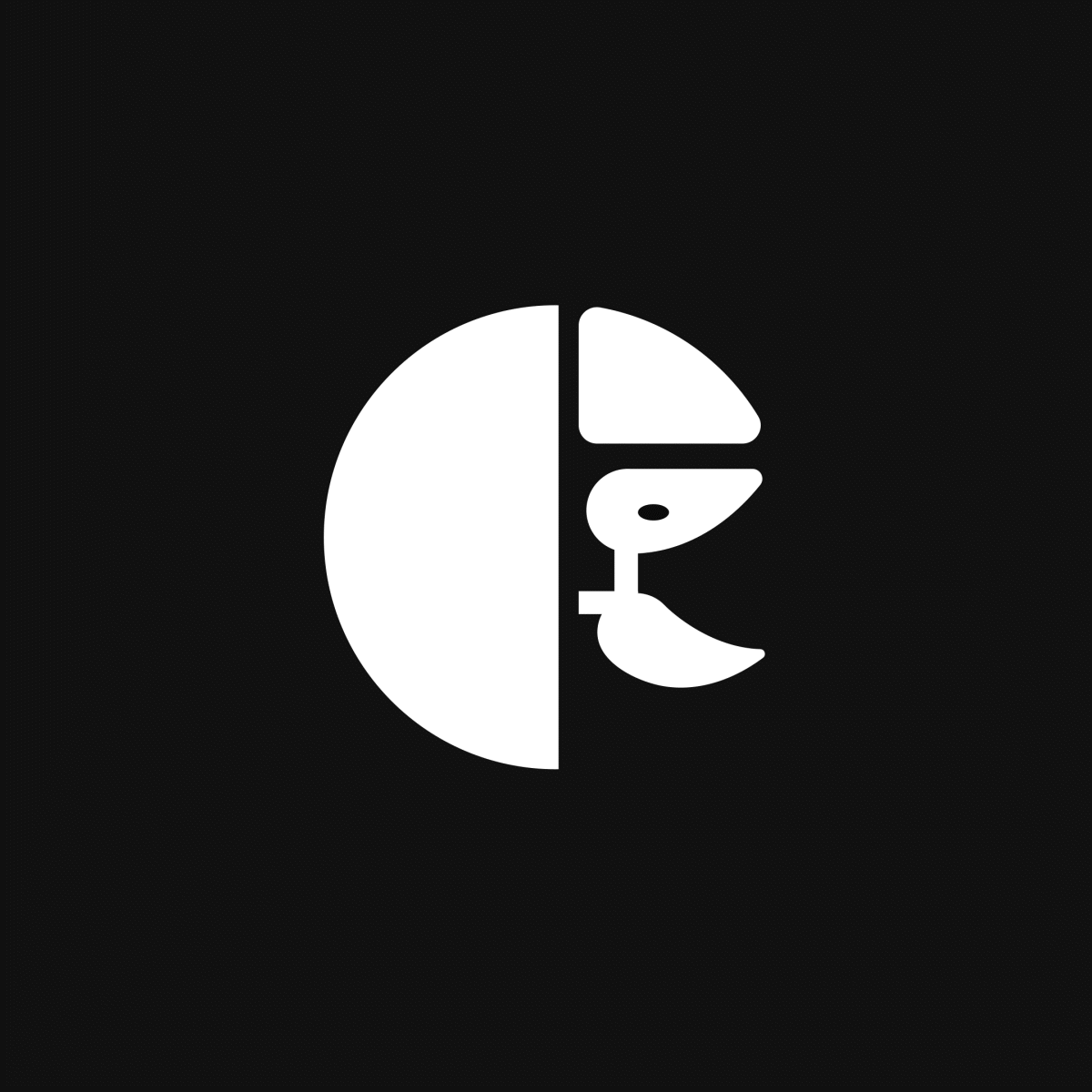
The brand logo represents a character that is half hidden, half revealed behind an abstract theatre mask.
The effect that is achieved by using a half circle on one side and a series of changing faces on the reverse side, which is implemented across all of their communications. The use of contrasting colours was inspired by the typical makeup and attire worn during performances and enhances the appeal of the visual identity.
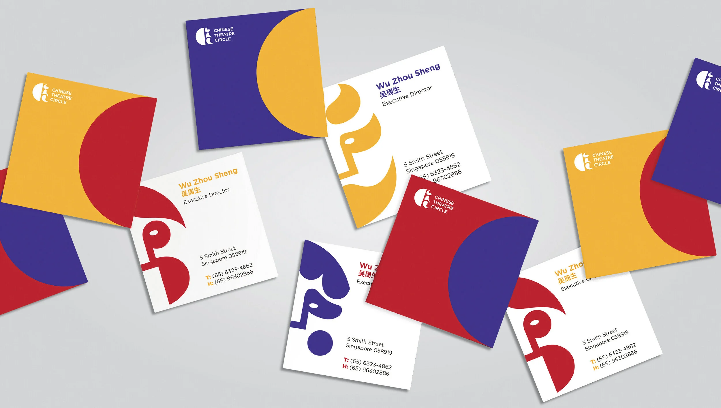
Name Card design
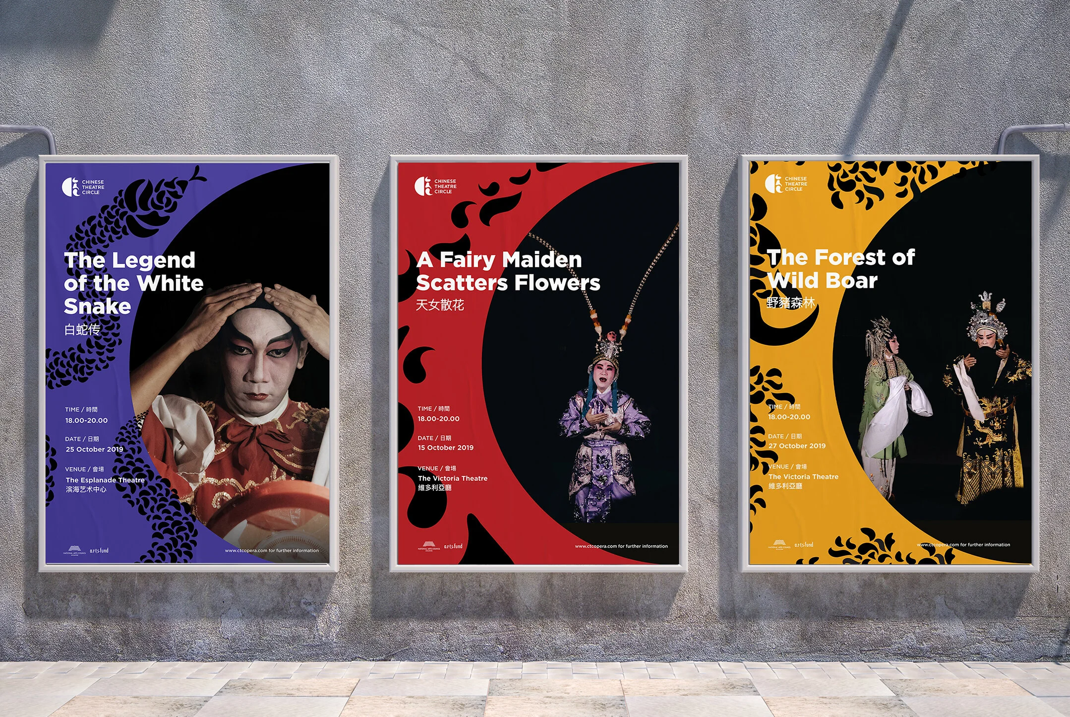
Poster design
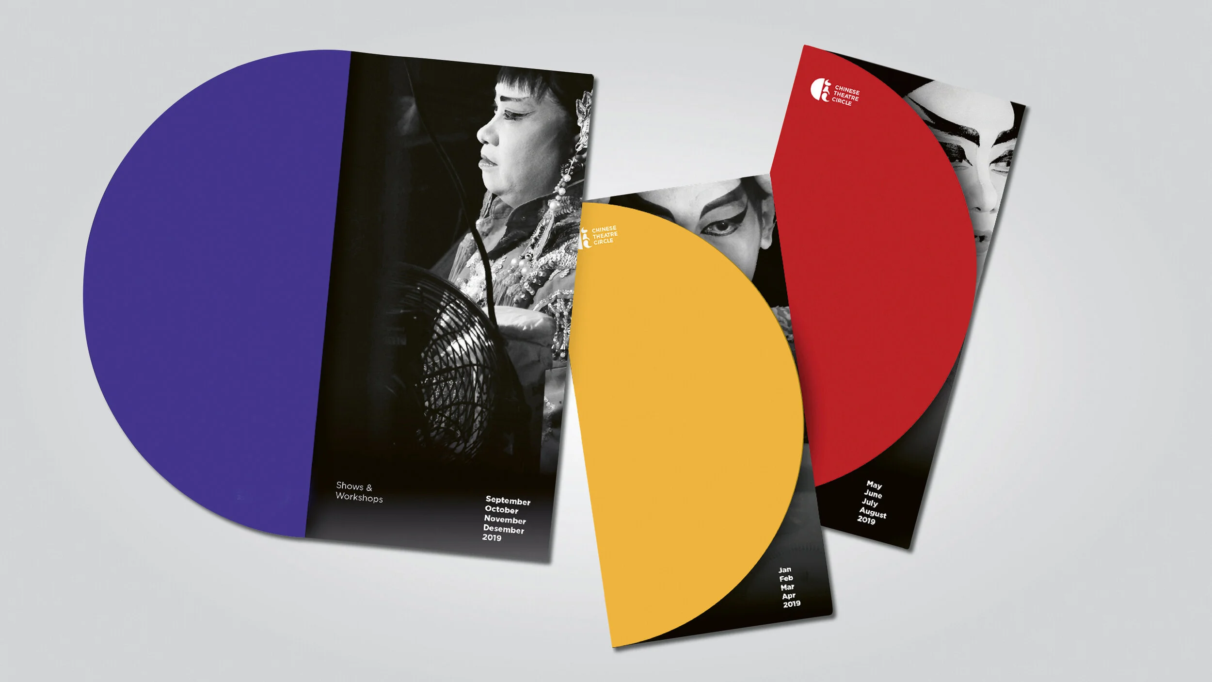
Brochure Design
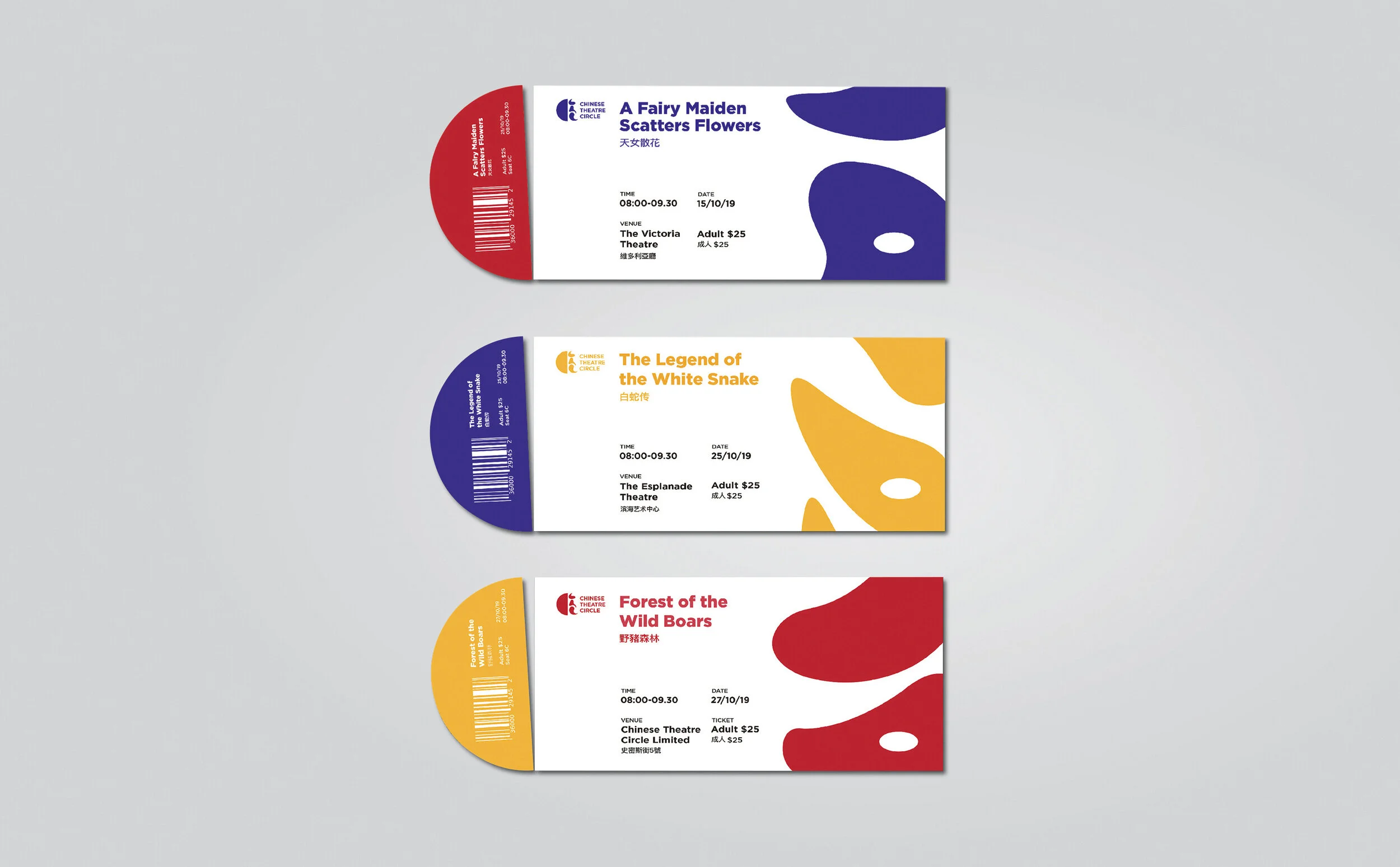
Ticket design
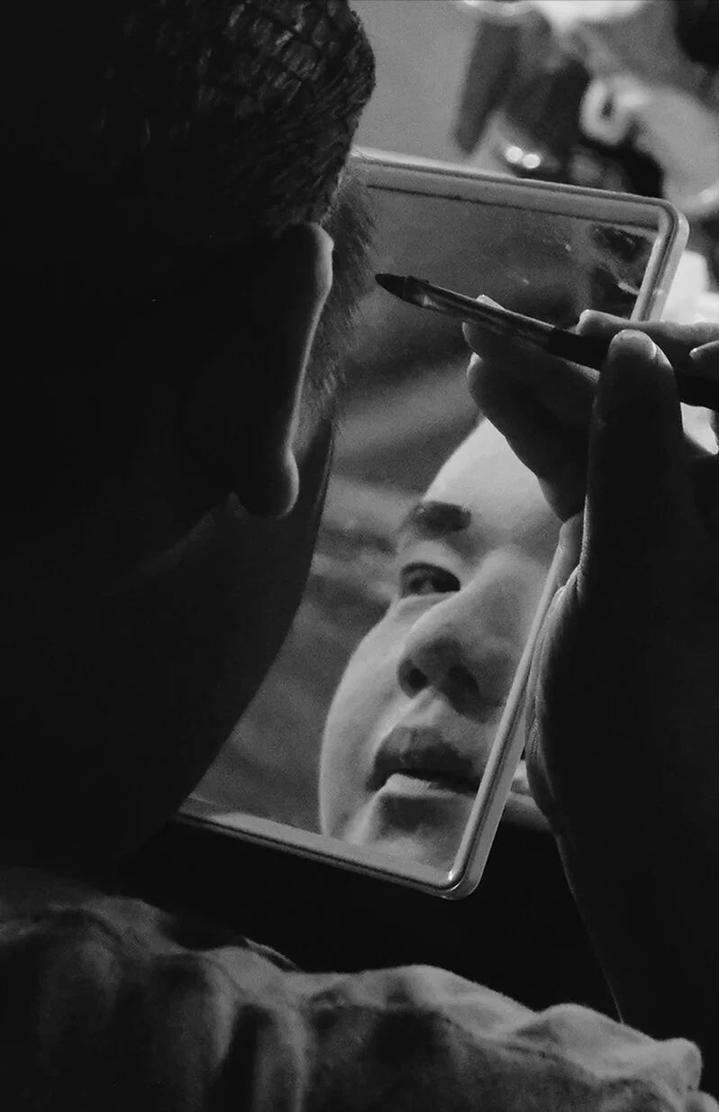
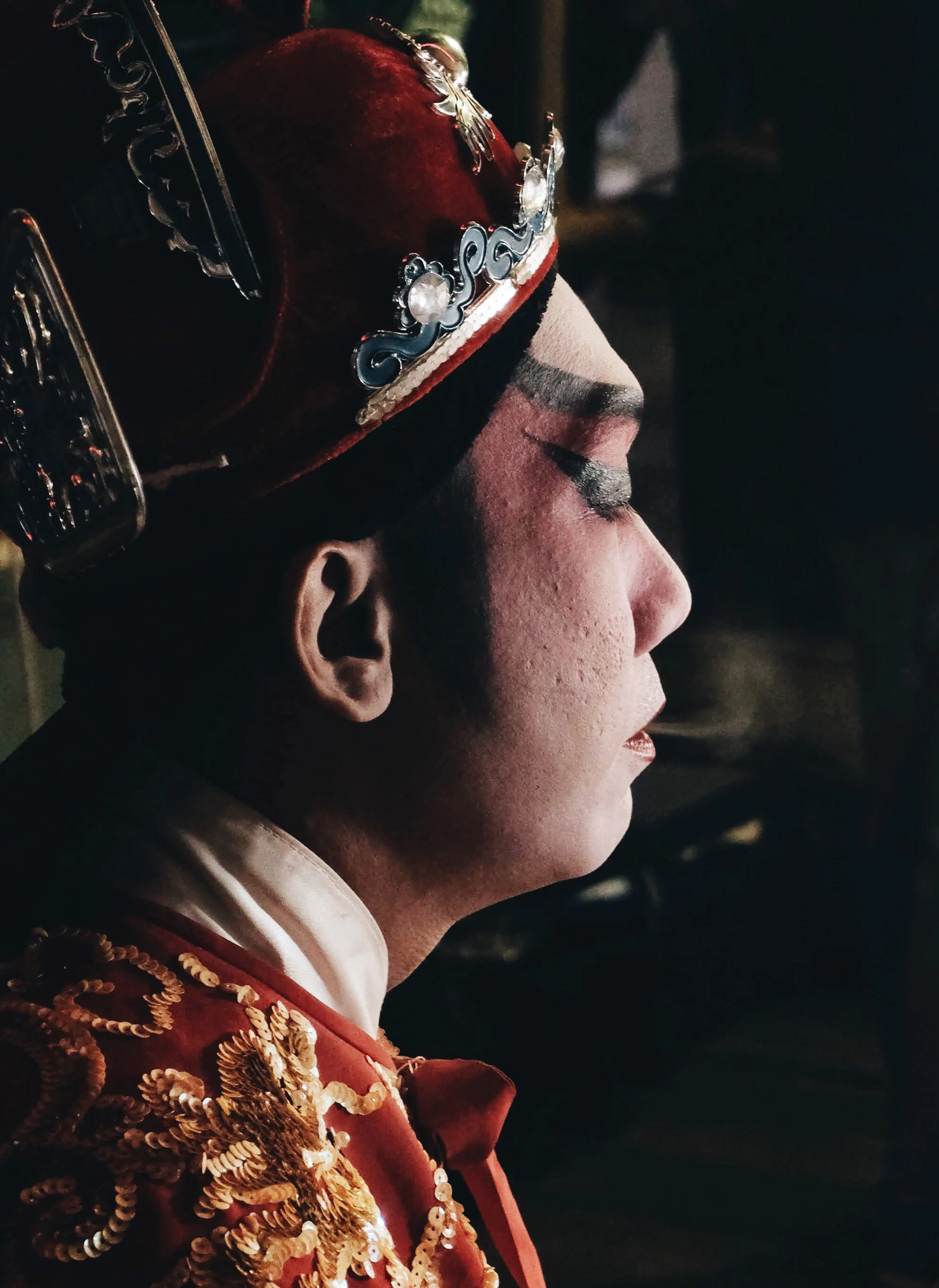
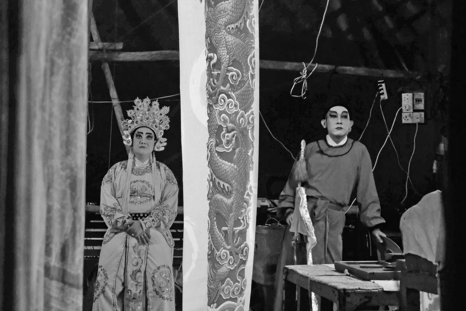
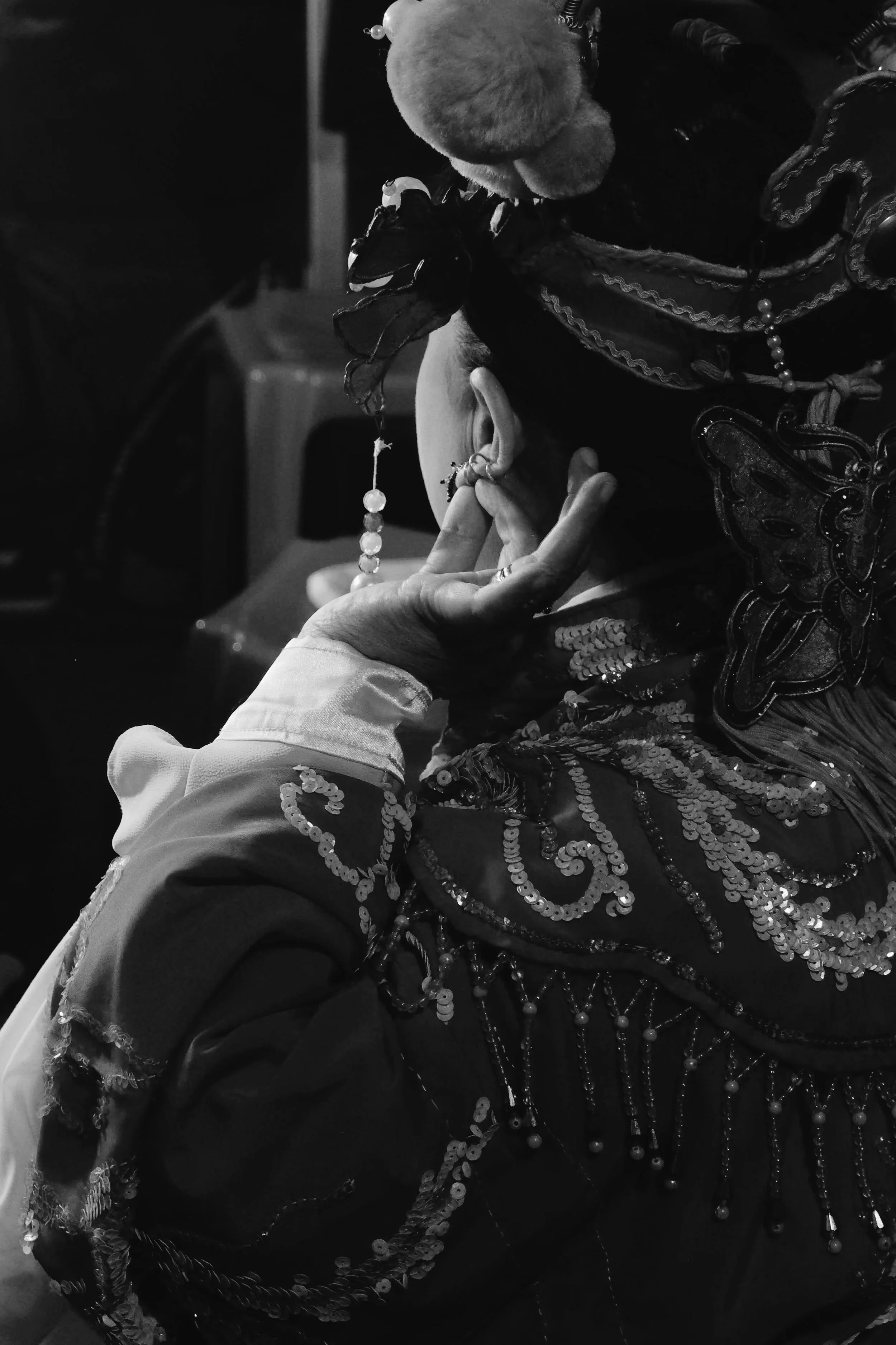
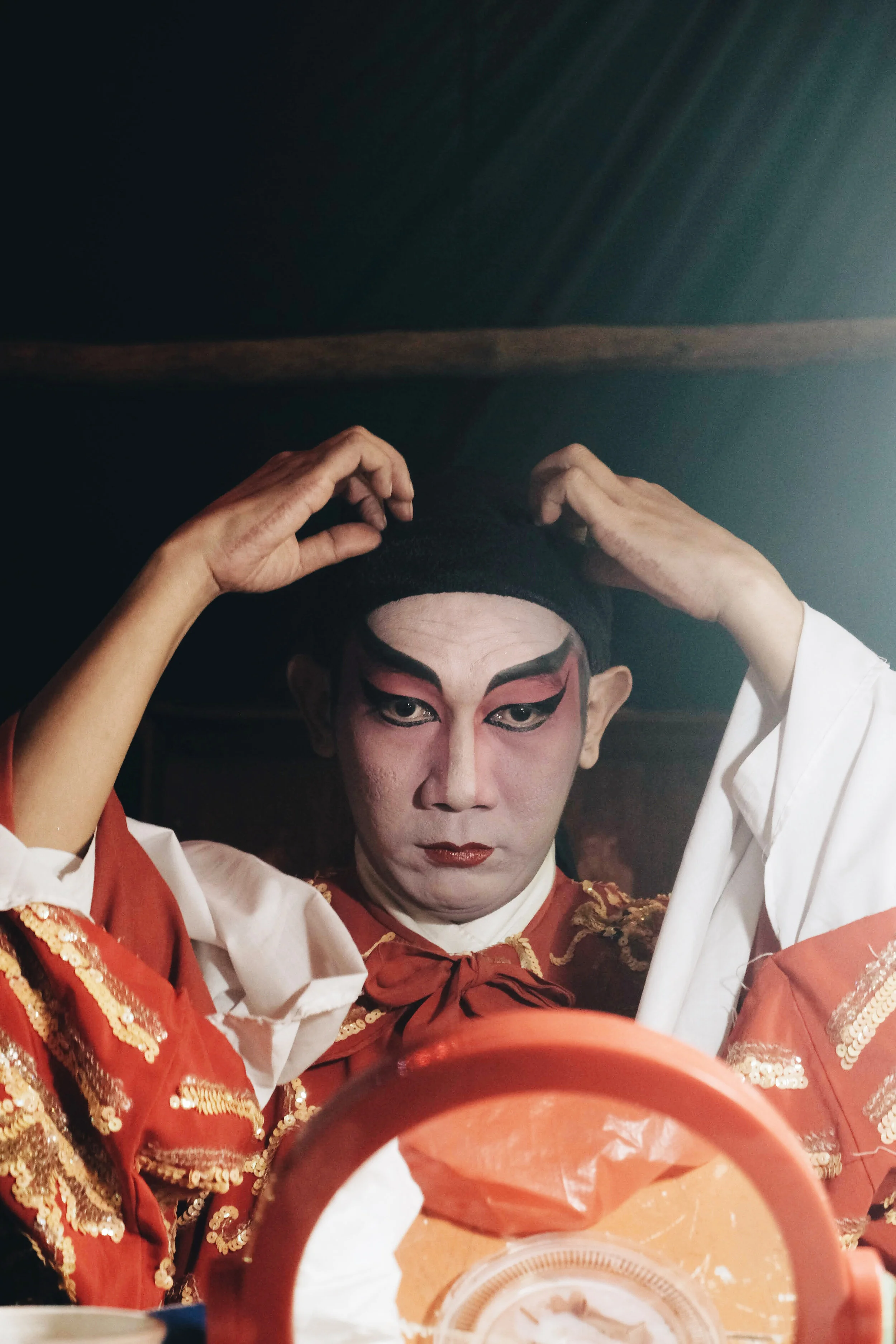
Visual Documentation
We went to the Chinese Theatre to capture their live performance, providing a richer understanding of their traditional culture. Our documentation includes behind-the-scenes footage of their makeup application, costume selection process, and their captivating on-stage performance.
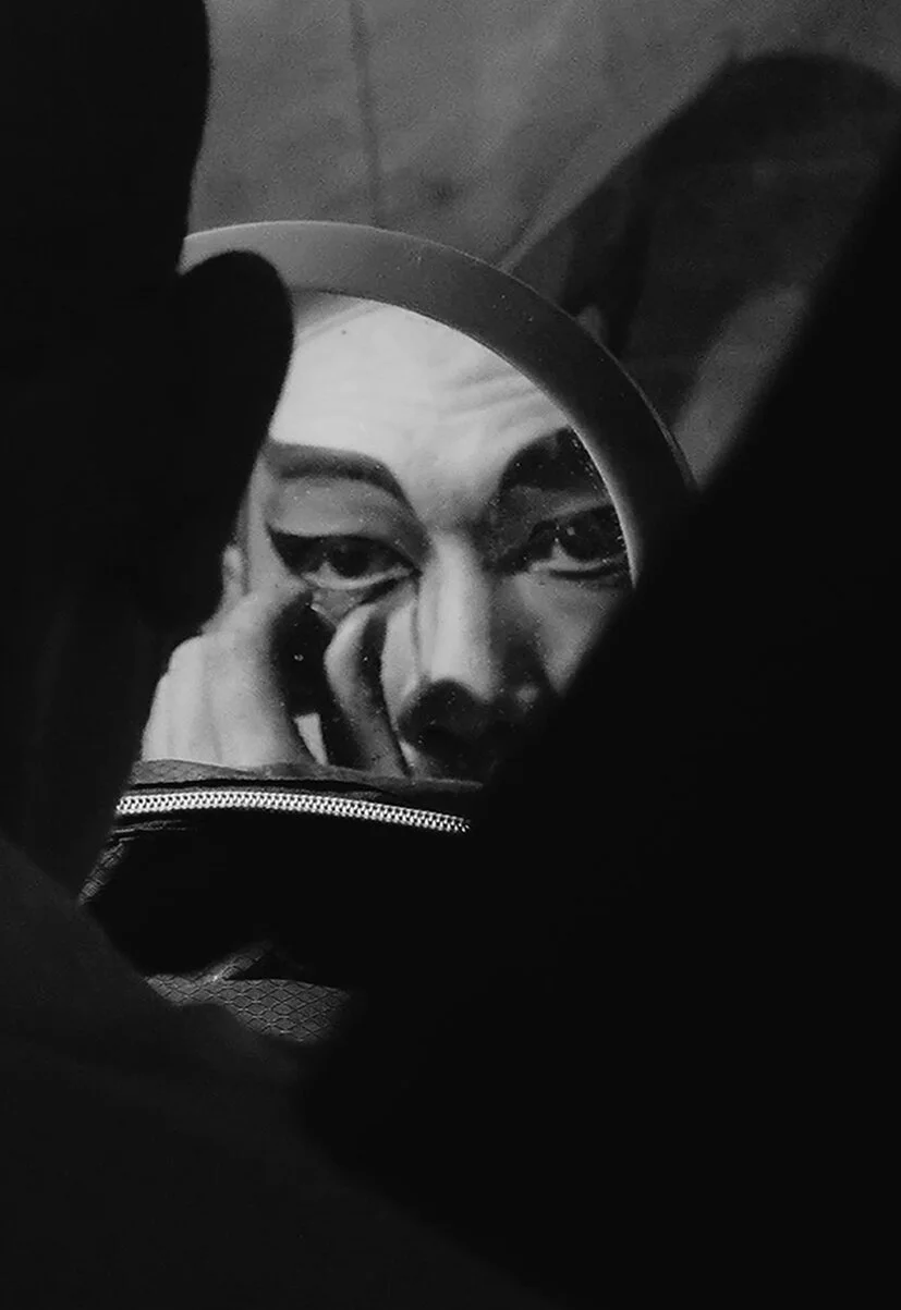
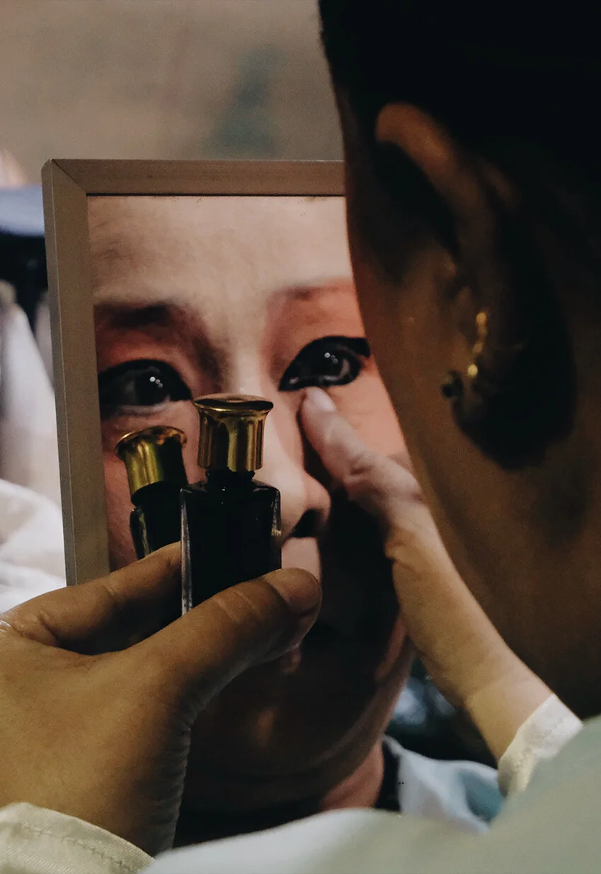

Photographed by Aileen Aurellia